Phone chrome
Spec
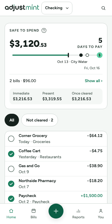
A slim top bar (logo, account switcher, search) and a bottom tab bar whose center button is Add transaction, so navigation and adding share the thumb zone. Designed at 320 × 740 and checked at 360 and 393.


Anatomy
- Top bar 56: logo 120px, the account switcher (name and chevron, no balance; long names end in "…"), and a search icon. No visible page title; the account name is a visually hidden h1.
- Balances: one row each, label, help icon and description on the left, amount right-aligned. Immediate first in the hero style, a divider, then Present and Once cleared. If Immediate can't fit beside its label (320px, large amounts), it moves under the label, still right-aligned; amounts never shrink.
- Rows: payee and amount on the first line; date and category on the second, full width. Only the category truncates. "Not cleared" is screen-reader text; the empty circle shows it.
- Tab bar 72 plus the safe area: Home, Bills, Add, Reports, You (opens the profile sheet, with the same items as the profile menu, including Take the tour and Show tips again). Labels text-caption; current tab in accent.
- Add: 52px circle in surface-action, raised 10px, labelled "Add transaction" for screen readers.
Behavior
- Search: the icon opens a field that takes over the top bar, with a close button. Escape or close clears it and returns focus to the icon.
- The pinned balances bar (on scroll) sits under the top bar and carries the shadow while shown.
- Below-zero cause lines run full width under Immediate, above the divider. The gap between Present and Immediate is explained in Immediate's help sheet, not on screen.
- Toasts sit above the tab bar. The tab bar hides only while the keyboard is open.
- Help icons keep a 44px tap area.
Built 1.0.1
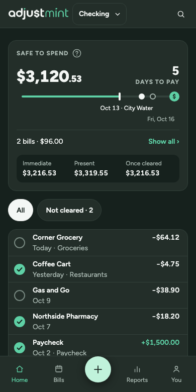
The app itself, version 1.0.1, with made-up data. Taken 2026-10-11.
Changes
- 1.0.1, Oct 7 2026: New wordmark, 120px. (#45, #46)
- 1.0.0, Sep 30 2026: Top bar, bottom tab bar with center Add.